The Name Is The Vocation
Taking Your Notion And Refining It Into The Design You Need!
See A Selection Of Notion Refinery’s Projects Below!
Colorized 3D Models
Where it Begins
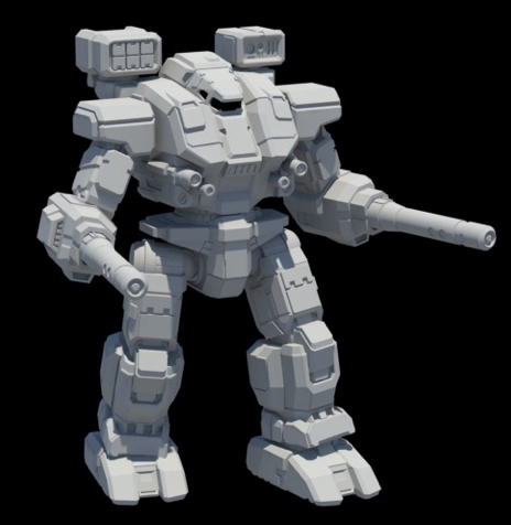
The images below started life as simple untextured 3D renders provided by the client.
In a way, this is where it all began. One of Notion Refinery’s first projects was a set of illustrations for Combat Manual: Mercenaries, a source book from the BattleTech intellectual property. The lion’s share of my contribution to that book was a series of colorized 3D renders.
Starting with simple shaded renders of untextured models, I used my years of experience as a photoshop hobbyist to build up richly detailed designs that capture the unique aura of the BattleTech franchise. I especially like the rich colors used in BattleTech, the storied iconography of the various forces meeting in fictional 31st century combat, and the grit of the setting.
I have been fortunate to work on several other projects in this vein, namely Combat Manual: Kurita, Battletech: A Game Of Armored Combat, BattleTech: Beginner Box, and other individual and forthcoming products.
To the left, I have included a couple instructional images, to give an idea of the “before and after”.
Mark Hayden, Managing Member

Thunderbolt, Ceti Hussars. Battletech: A Game Of Armored Combat. ©2018 Topps.

Warhammer, Thermo Police. Battletech: Spotlight On: Thermopolice. ©2020 Topps.

Shadow Hawk, Carlyle's Commandos. Battletech: AGOAC. ©2018 Topps.

Battletech 35th Anniversary Warhammer. ©2019 Topps.

Shadow Hawk, Lexington Combat Group. Battletech: AGOAC. ©2018 Topps.

Locust, 8th Rasalhague Regulars. Combat Manual Kurita. ©2016 Topps.

Marauder, 1st Night Stalkers. Combat Manual Kurita. ©2016 Topps.

Warhammer, Waco Rangers. Combat Manual: Mercenaries. ©2016 Topps.

Locust, Eridani Light Horse. Combat Manual: Mercenaries. ©2016 Topps.

Warhammer, Langendorf Lancers. Combat Manual: Mercenaries. ©2016 Topps.

Battle Master, 1st Proserpina Hussars. Combat Manual Kurita. ©2016 Topps.

Thunderbolt, Capellan Hussars. Battletech: AGOAC. ©2018 Topps.

Warhammer, 11th Fusiliers. Combat Manual: Mercenaries. ©2016 Topps.

Marauder, Hassid Ricol. Combat Manual Kurita. ©2016 Topps.
Logos and Iconography
Growing up in the shadow of McChord Air Force Base and Fort Lewis (long before Joint Base Lewis McChord) I was surrounded with the rich iconography of the US armed forces. In no small way, this lead me to a life-long love of composition and symbolism.
This interest would eventually encompass iconography and even vexillology. I was fortunate enough to have access to art classes in high school, and was able to learn key lessons about design and composition. I eventually immersed myself in Photoshop which after years of practice became like second nature to me.
I subscribe strongly to the ethos of “Less is More”. My approach to logo design is to whittle an idea down to a core concept, using clear, contrasting colors, and working to ensure the design is legible and beautiful.
Of course, if a client has a particular idea in mind, I’m more than happy to incorporate their vision into my design.
Mark Hayden, Managing Member

Carlyle's Commandos. Battletech. ©2018 Topps

22nd Rasalhague Regulars. Combat Manual: Kurita. ©2016 Topps

11th Benjamin Regulars, Combat Manual: Kurita. ©2016 Topps
A Note On The Design Process: Rasalhague Regulars
In mid 2016 I was given a choice undertaking; the creation of a set of insignia for the Rasalhague Regulars, a military formation of the Draconis Combine in the BattleTech setting. Happily, with a few exceptions, I was largely given free reign to develop the insignia as I saw fit, while keeping within the broader context of the setting.
The Rasalhague Regulars are a somewhat unique formation in the BattleTech setting. In the service of the Draconis Combine’s House Kurita, a faction with decidedly Japanese motifs, the Rasalhague Regulars are meant to operate in an area of space where Scandinavian and Japanese culture intersects. Each constituent regiment of the Rasalhague Regulars was meant to have its own unique insignia, and as each regiment had its own nick name, back story and history, I was eager to draw on these elements to better flesh out the designs
Mark Hayden, Managing Member
5th Rasalhague Regulars
“Crushers of Insurrections”
A design that had little in the way of description, beyond the unit’s nickname, I sought to incorporate an element of blunt destructive power. I turned to the legendary hammer of Thor for this, incorporating a dragon motif into the hammer as a nod to House Kurita. The Hammer radiates lightning, and hovers vigilantly over a blackened world, the graves of those who would oppose the 5th Rasalhague Regulars far below. I used a light orange/goldenrod border to add some warm contrast to an otherwise cool image.
13th Rasalhague Regulars
“Bane of the Commonwealth”
I wanted to tap into Scandinavian imagery on this one, but not in an opaque way. I settled on the idea of borrowing heavily from the Danish coat of arms, incorporating a yellow base while working in the red hearts from the same; in this case thirteen to represent the number of this particular regiment. I replaced the three blue lions from the design with a single blue dragon, an homage to House Kurita’s symbol. The dragon circles a flask of poison, and floating in the murk is a severed hand, quite literally symbolic of the unit’s nick-name, “Bane of the Commonwealth”.
20th Rasalhague Regulars
“The Torturers”
The idea of torture represents bodily harm and discomfort. In this case, I again made the decision to incorporate an element of the Rasalhauge Regulars’ chief antagonists; House Steiner. The symbol of House Steiner is often depicted as a blue gauntlet clenched to make a fist. This design plays off that idea by subverting the imagery of a blue fist; binding it at the wrist, the hand turning blue because of constriction. The ultimate effect is a visual representation the unit’s nickname while tying in to the setting’s inter-factional rivalries.
The Managing Member’s personal flag.
Vexillography
Now and then, I’m given the rare privilege of designing a flag. Often, this is simply a work of fiction for the gaming industry. Other times, it’s a creative exercise, or an earnest proposal for a real-world flag.
So far, only one of my designs has been realized in physical form; a personal flag I designed and then commissioned a local flag maker to manufacture. I aspire to grow this body of work.
Mark Hayden, Managing Member

Flag of Coromodir VI. House Arano: The Aurigan Coalition. ©2019 Topps.

Flag of Weldry. House Arano: The Aurigan Coalition. ©2019 Topps.

Flag of Panzyr. House Arano: The Aurigan Coalition. ©2019 Topps.

Personal Flag. ©2020 Mark Hayden
A Note On The Design Process: Custom Flags
While I am happy to design a flag for you, Notion Refinery unfortunately lacks the means of production to make the physical flag.
Mark Hayden, Managing Member


